We all gain knowledge from our mistakes, and web designers are no different. We’ll outline the mistakes many of them commit in this blog when building user interface designs.
In the creative work of a web designer, it might be challenging to stick to acknowledged rules. It is, in fact, much more convenient to be guided by “how not to do” knowledge. We made the decision to compile a list of the worst UI design blunders as a result.
UI Mistakes: Please Avoid This
Do you want to know the mistakes even UI designers with experience make? Welcome to our top 5 then!
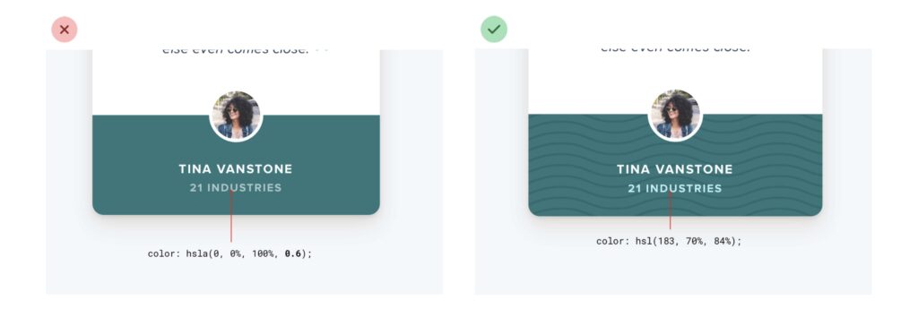
1.Gray text on colored backgrounds
Each of us has had experience utilizing websites and using online applications outdoors in the bright daylight. And everything would be perfect if we could distinguish between words and numbers thanks to the contrast between the font and the background. However, for some reason, the majority of webmasters overlook these nuances. Mobile users are consequently compelled to cover their screens with their hands or hide in the shadows in order to deal with the issue. Before selecting a solid background for a gray font, give it some thought.

2.Taking up the entire screen
Little doesn’t always imply terrible. It’s not always improper when certain web pages have very little material; the key is to distribute it equitably. On the other hand, some webmasters try to clog up open space by selecting larger fonts and stretching banners and graphics. It frequently turns out to be absurd. Don’t be like these webmasters; if there isn’t much content, leave some space.

3.User-uploaded content, third
Allowing users of your website to independently add graphic files to publicly accessible web pages isn’t always a good idea. This is due to a variety of factors, including inappropriate content and the low resolution of these photographs. Therefore, make sure to integrate moderation algorithms before making this choice available to your target audience.

4.Stunning style
A lot has already been said about the overabundance of items on websites. We will only emphasize the importance of adhering to the maxim “less is more,” particularly when it comes to cutting-edge, experimental websites that are created from scratch. Keep in mind that this may not only appear ugly but may also confuse users.

5.Improper padding and spacing
The worst issue is when site designers neglect to provide adequate padding and spacing between interface elements. As a result, even adaptable and adaptive layouts could be useless because text on small format devices is so small that zopping is required in order to see it.

Last Words
Of course, we haven’t covered every common error webmasters make when designing user interfaces. However, we believe that this list will protect you from the most irritating ones. So, be motivated and push yourself to new levels of web design!


